Excel Dashboards
Remote work Challenge - Maven Analytics

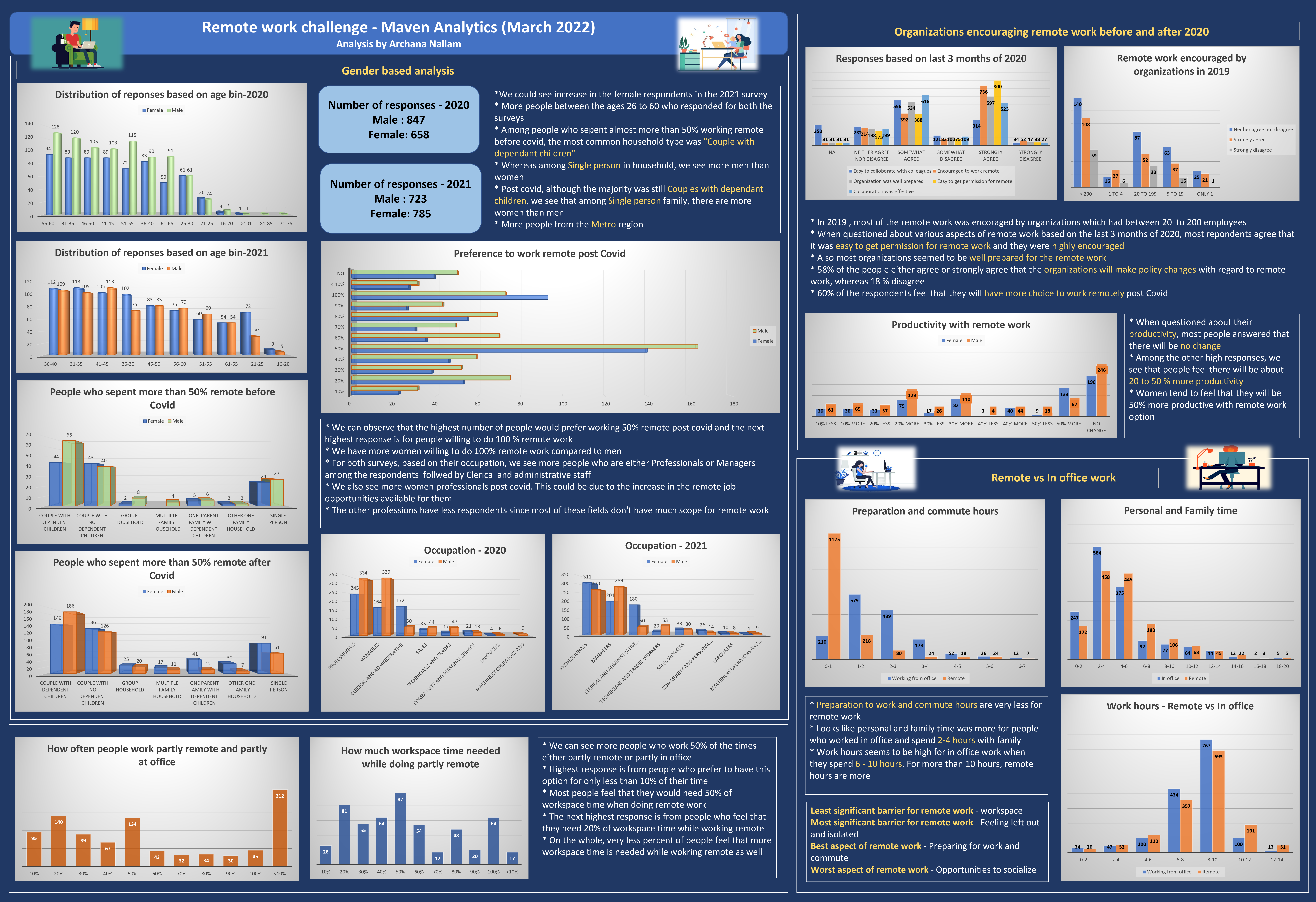
This dashboard was created using Microsoft Excel. I have used Power Query and Pivot tables to create visualization.
The dataset has really been very interesting and on the first look it was so overwhelming as there was way too much text in the column headers. I preferred to do some data cleaning in Excel to make it more understandable and then proceeded with the analysis. Since this is my first dashboard using Excel, I preferred to use basic charts appropriate for this dataset and tried to keep it simple.